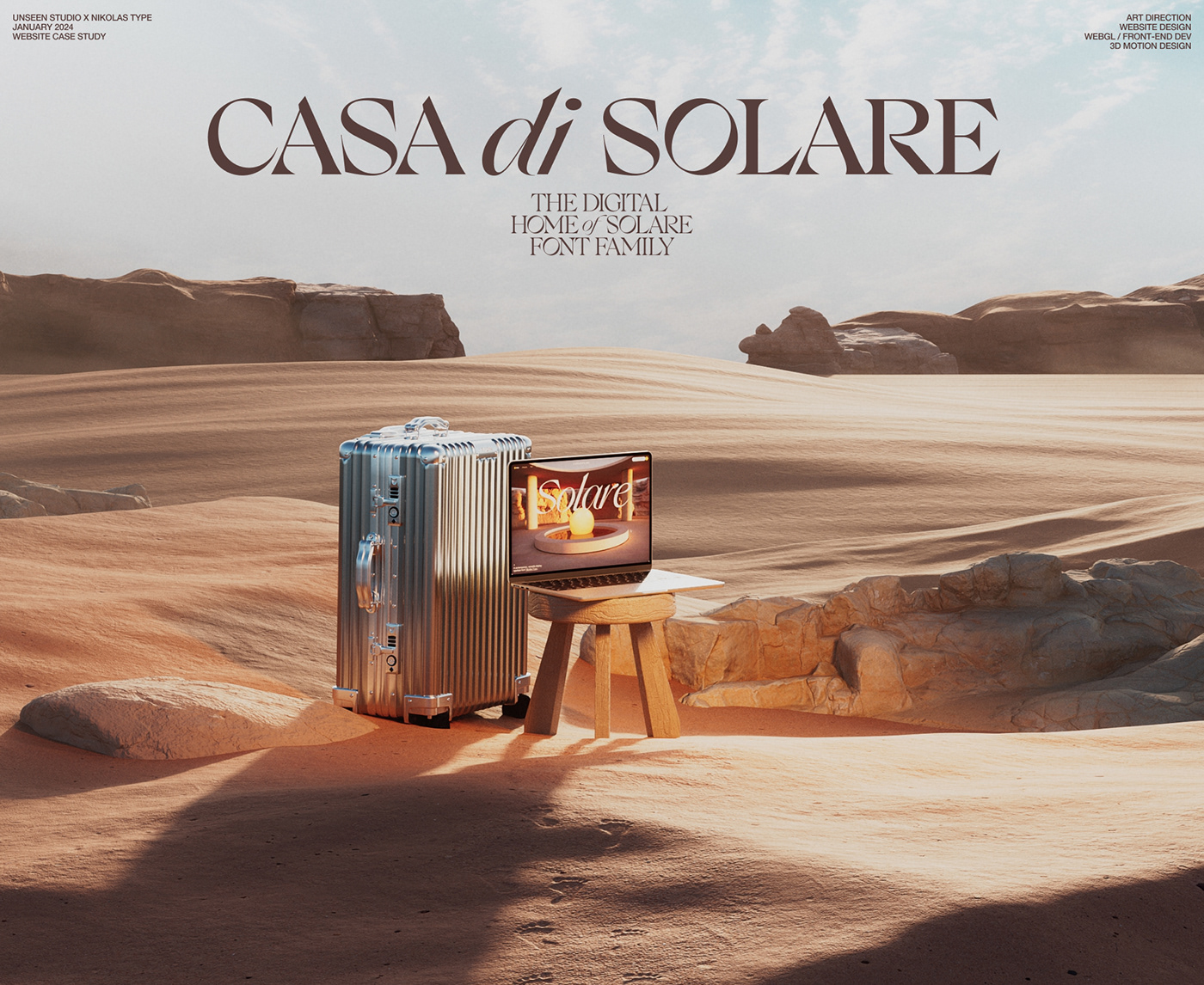
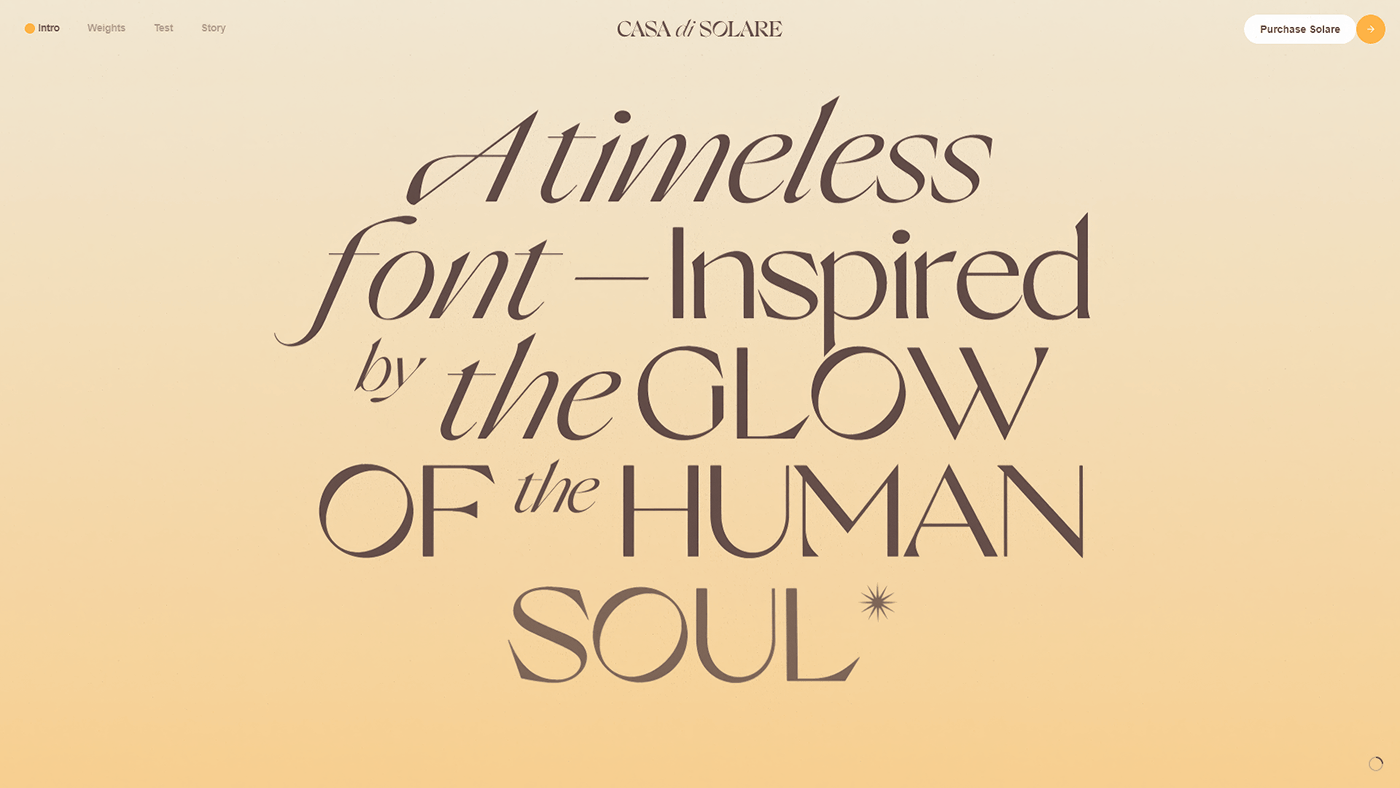
Casa di Solare
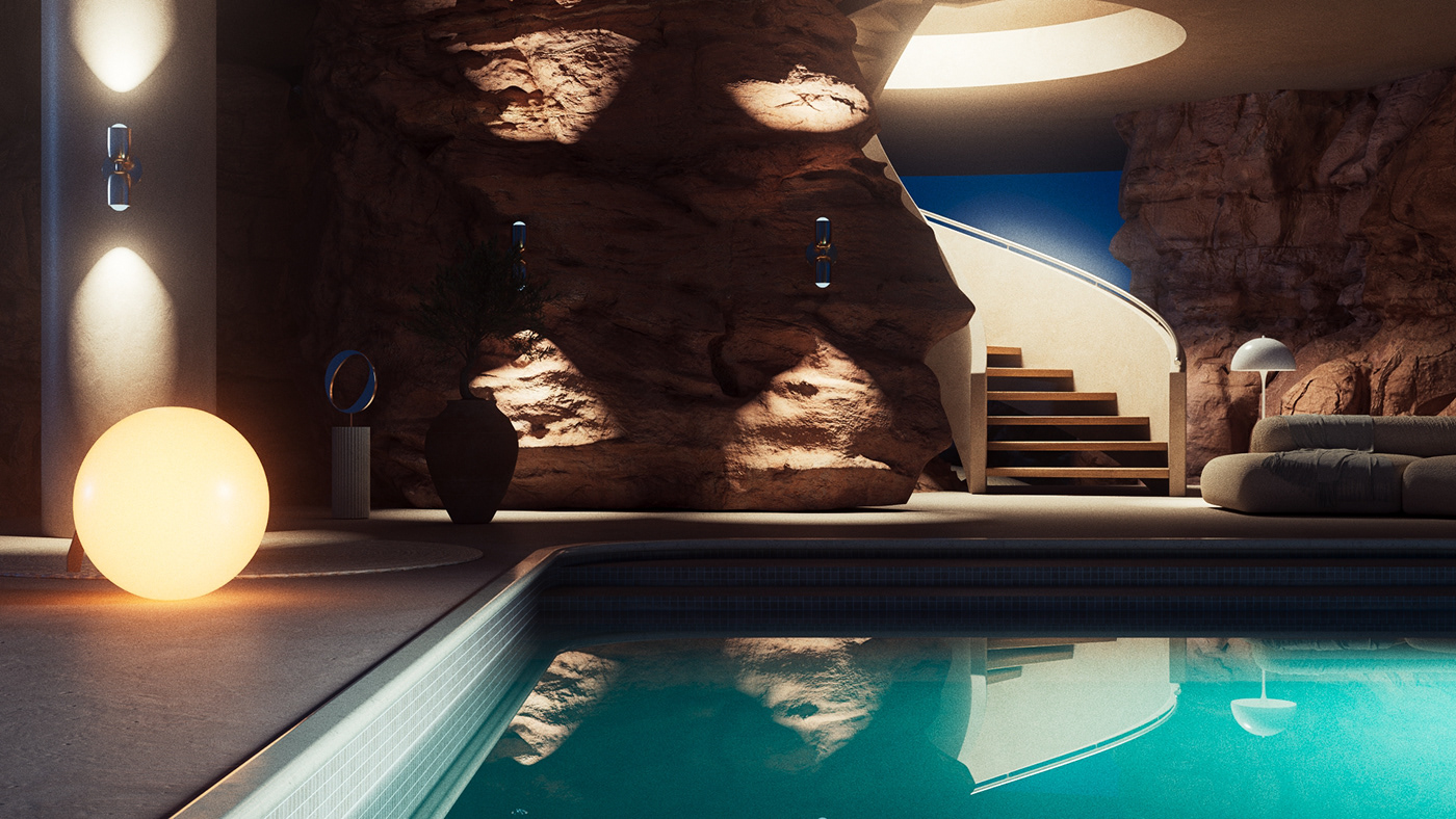
A digital oasis and home to the beautiful new font family by Nikolas Type. When Nikolas approach us with this project we jumped at the opportunity to push the boundaries of what a typography showcase could be. Taking inspiration from the font name "Solare" and the origins of it's design, the sun and it's magical power has highly influenced all aspects of the website, from sun dial text displays to the striking yellow tones in the UI.


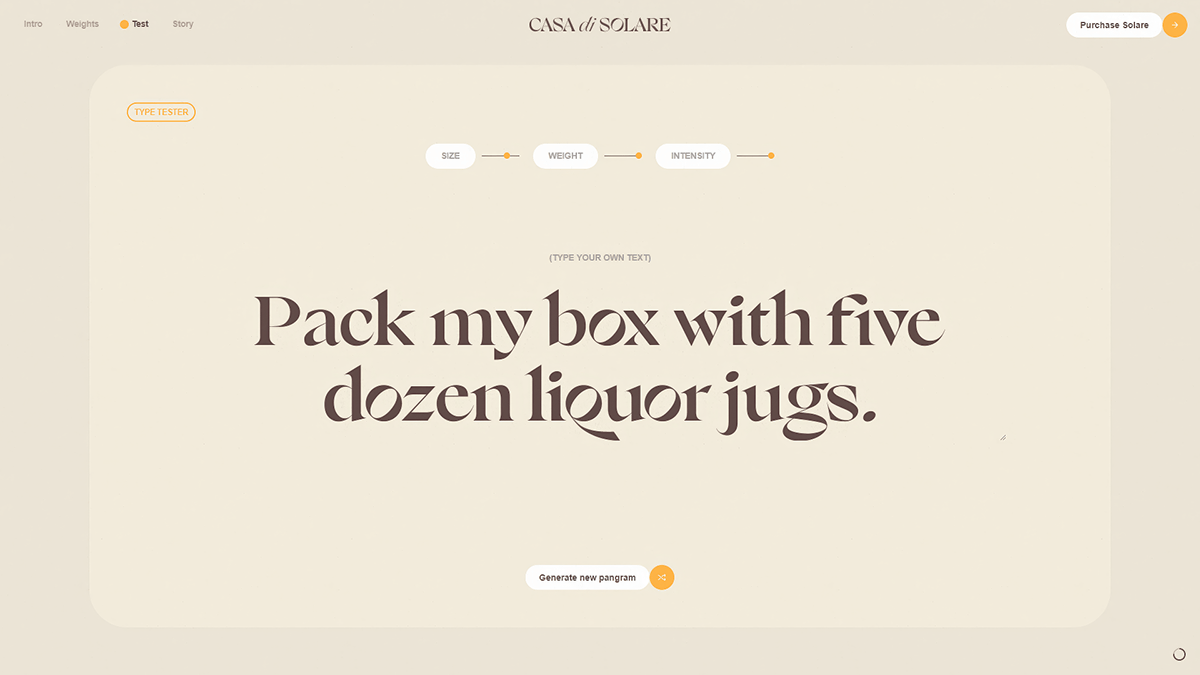
How do you create visual metaphors for the weights of a font family?
As with every element on the website, we were deeply inspired by the origins of the type design and came up with the concept of tying the font weights to levels of sunlight. This created a powerful visual link between the weights and intensities.